
Making our data even more beautiful
by
Visualising data is nothing new in healthcare communications. But there are always ways to do it better
Ain 2017, Data Journalist & Information Designer David McCandless hosted a workshop based on his books, Information is Beautiful and Knowledge is Beautiful. I was lucky enough to secure a place. His books unveil the intricate and often amusing stories lurking in the data surrounding (and often swamping) us. His workshop explained how to create clear and exciting visual pieces from dry information to help people make more informed decisions about the world, even if from a single glance.
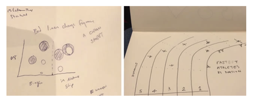
David is amazingly enthusiastic. You can’t help but feel inspired listening to him. He invited us to ‘think of anything’ as a means of finding stories to explore. Our suggestion, the frequency of bed linen changes based on age and relationship status, made everyone laugh and was an excellent ice-breaker. David walked us through the core elements of his approach and common goals across all ideas. He stressed the importance of communication in the early ‘seed’ stage while thinking about: what it is that you are trying to achieve, how to tell a story clearly, and how to show something new. We created rough sketches that helped develop our ideas into messages that everyone can follow.
It was thrilling to see similarities in the way we work at Wordbird; typography and colour are as important and ingrained in his daily processes as they are in ours. Afterwards, we recreated some of the workshop exercises with the Wordbird team to see how they’d react.
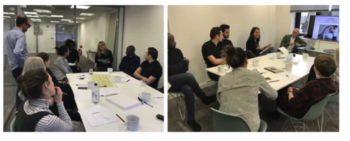
It’s improved our output; we had a big data visualisation project recently and our rough sketches helped confirm our understanding of what the client wanted. The workshop also helped us formalise our process for creating infographics and highlighted things to improve upon. David’s tip for using negative emotions instead of positive ones to generate ideas was interesting and handy. Switching things around during a creative block can really help get things moving!
By Andrew Nicholson, Creative Director and beautiful-data enthusiast
Graphic credit: David MacCandless